- Client
- TAKA NO MI (concept)
- Role
- Creative direction, brand identity, courts & equipment design, AI imagery & film
- Year
- 2026
- Tools
- Claude, FLORA, Nano Banana Pro, Seedance 2.0
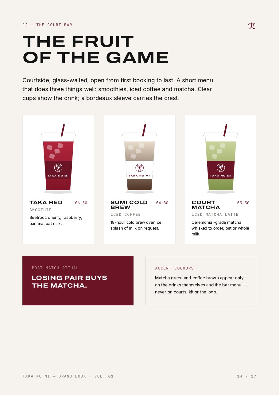
鷹の実 — 'the hawk's fruit'. The hawk is the player we all want to be: eyes fixed on the ball, patient, then striking from above. The fruit is the ball it chases, what practice grows into, and — literally — the smoothies, iced coffee and matcha at the court bar.
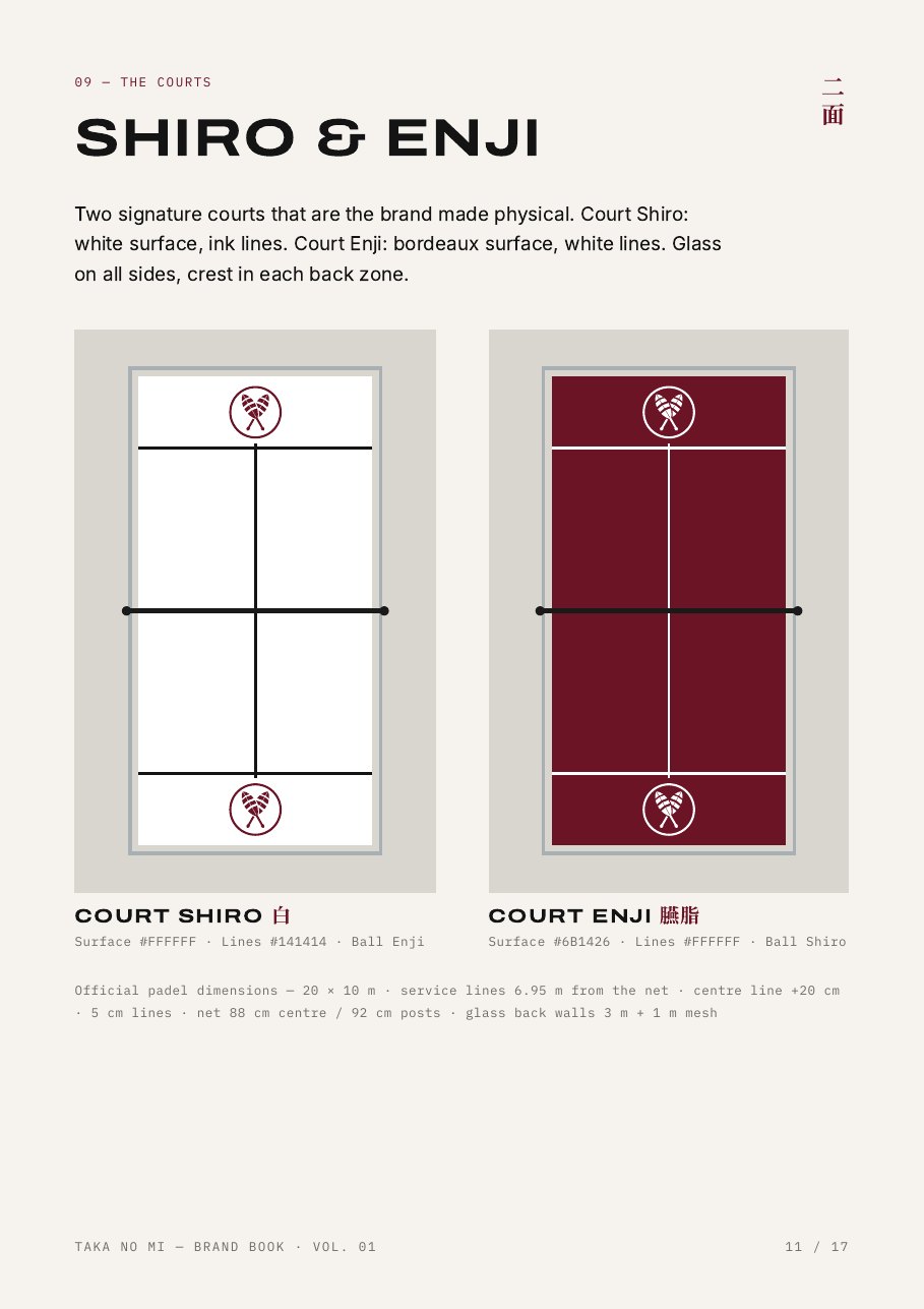
The crest redraws chigai takanoha, the crossed hawk feathers that are one of Japan's most used family crests. Here the feathers double as two crossed padel rackets — padel is always doubles — inside a ring that is the ball. Two colours do all the work: Enji bordeaux and Shiro white, with Sumi ink for the lines.
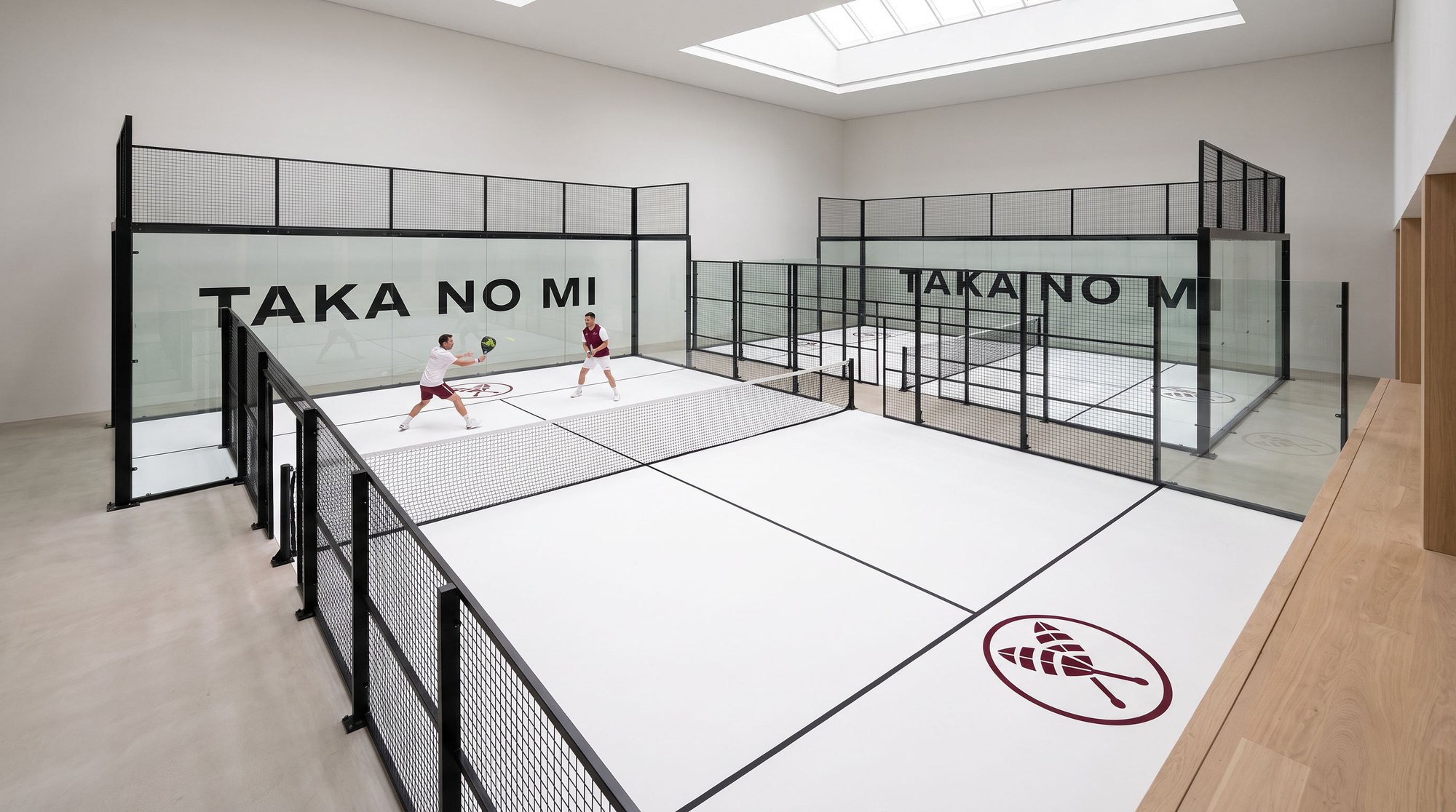
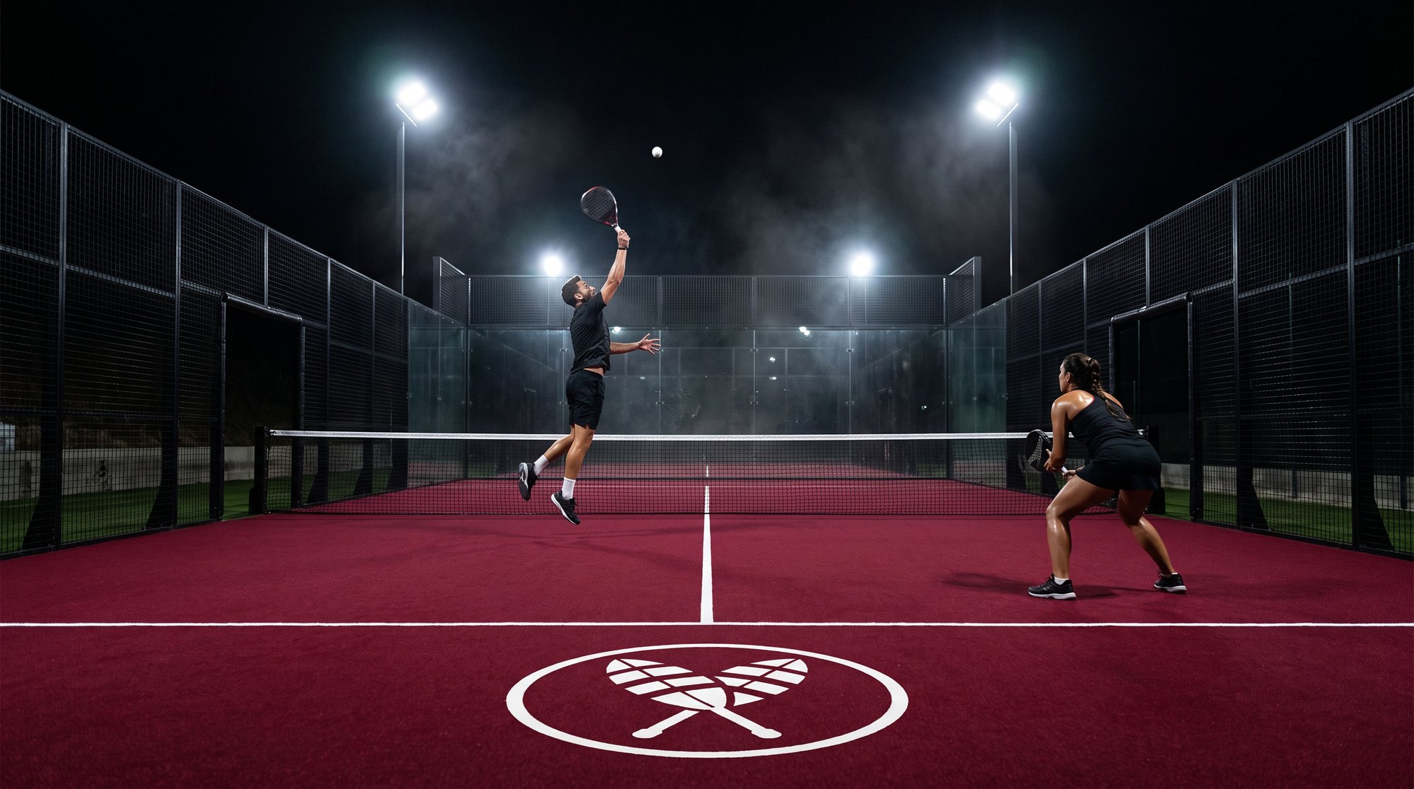
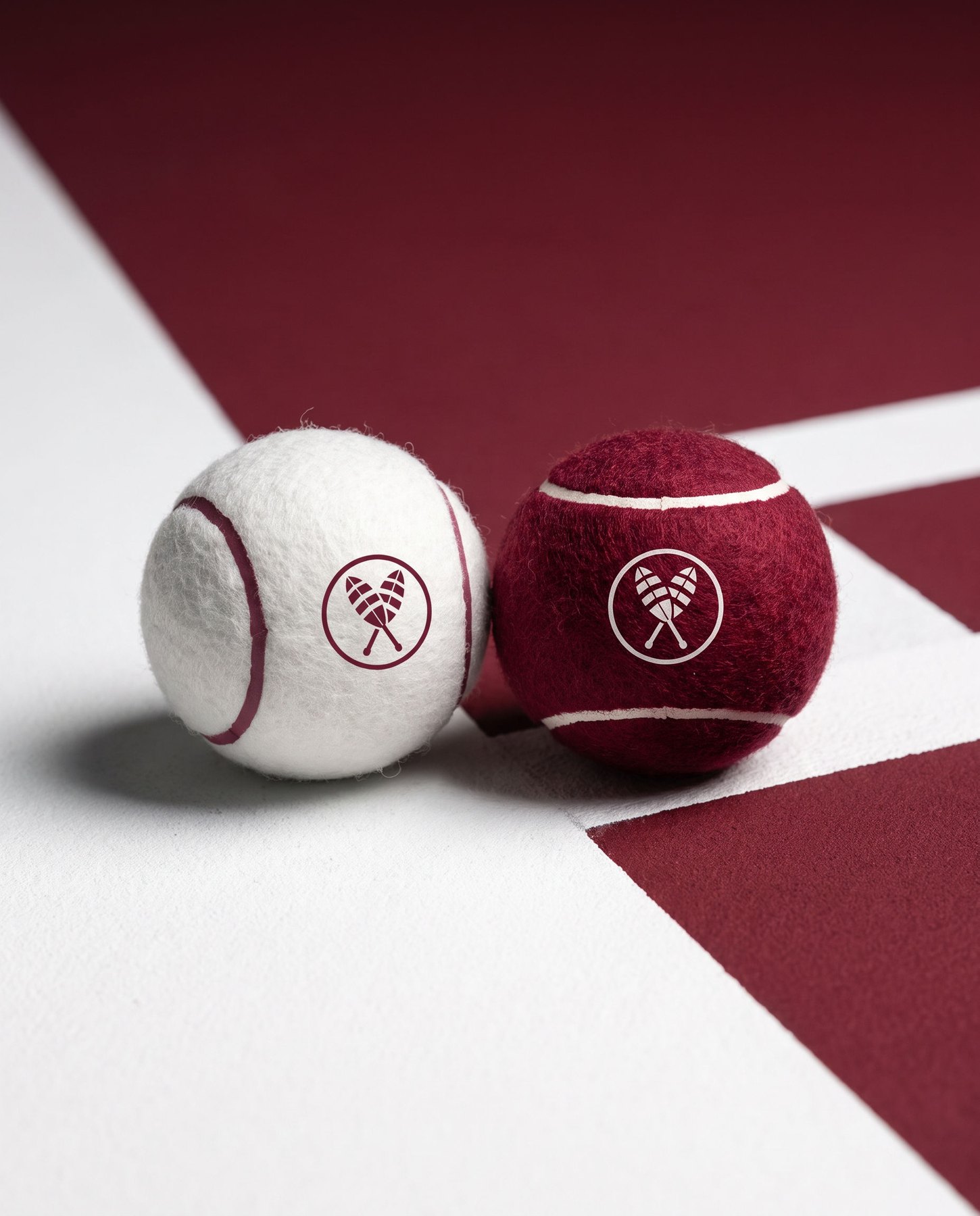
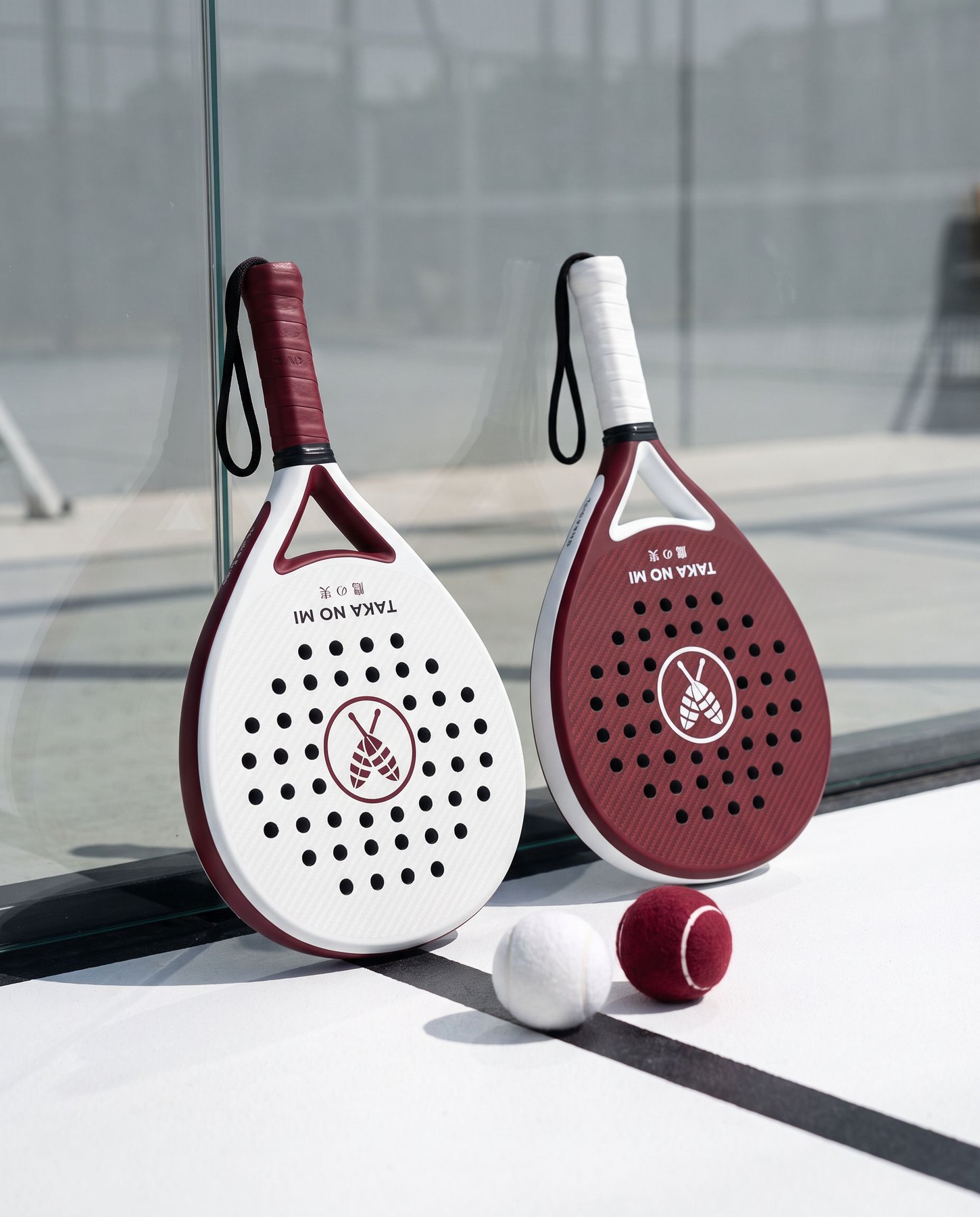
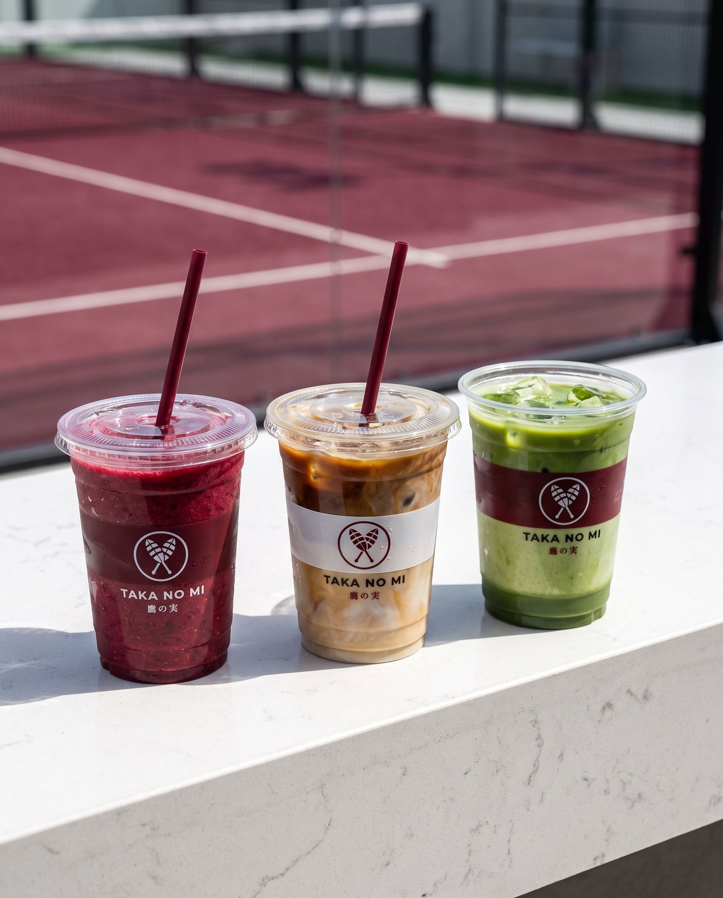
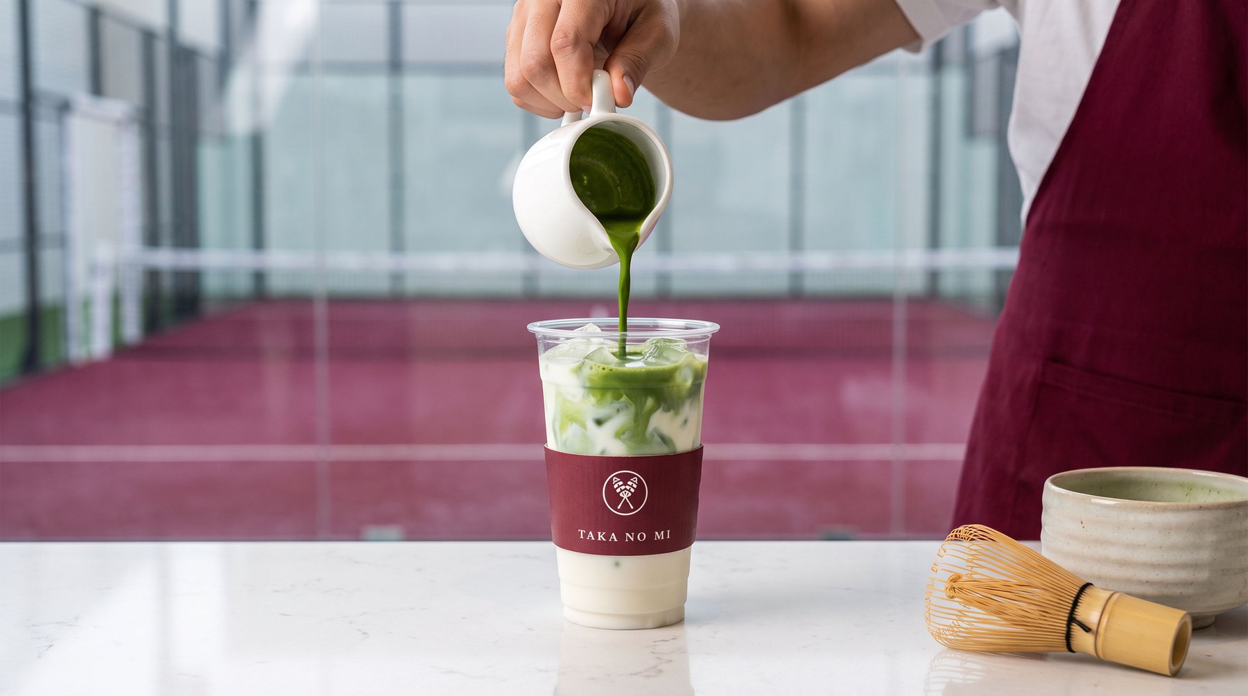
Built for every touchpoint.
A 17-page brand book: name, crest, colour, type, courts, equipment, court bar, film & UGC direction.
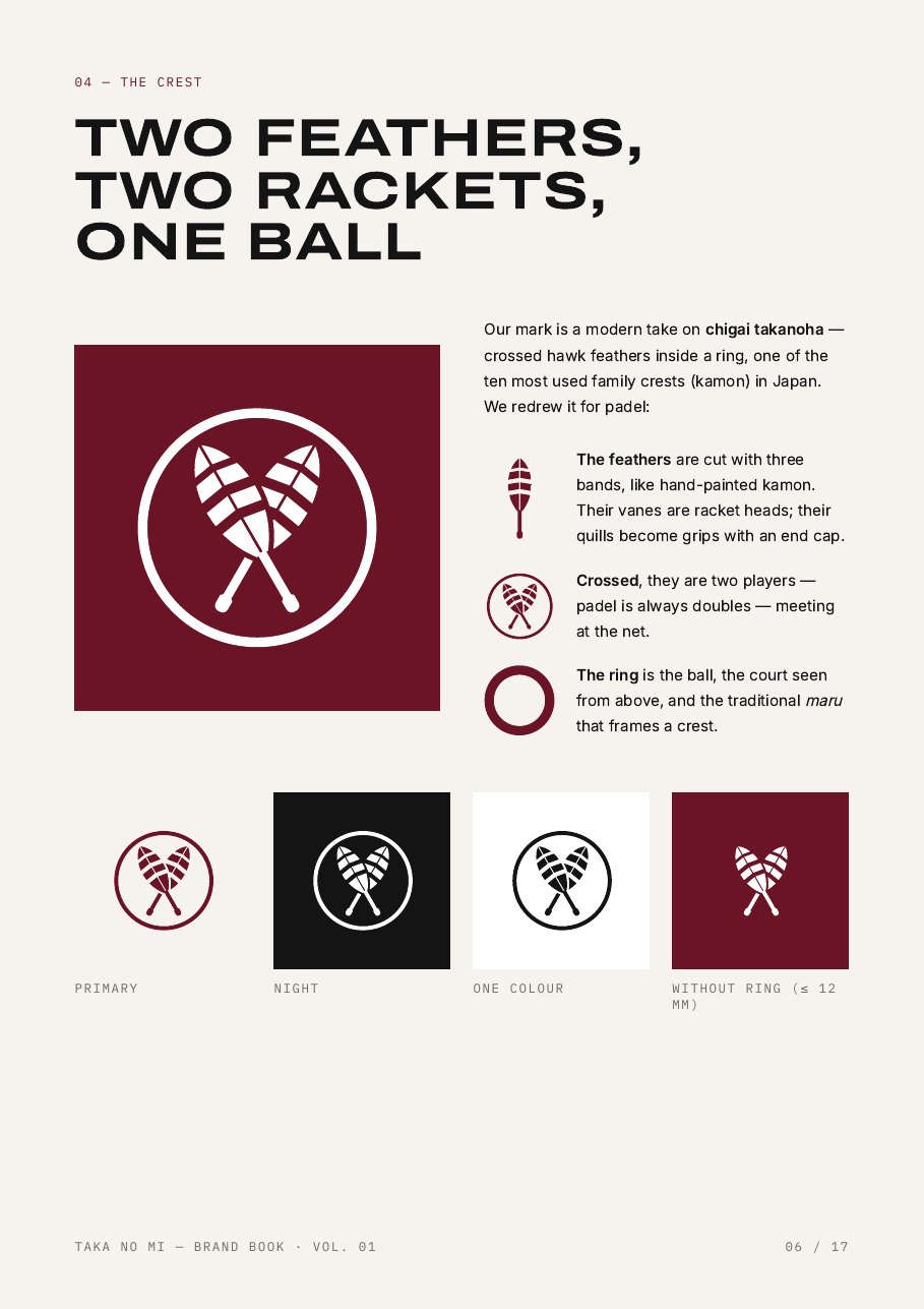
Every image and video was generated with AI from a hand-built brand system: the real crest, equipment and cup designs were fed in as references so the mark stays exact across courts, gear, cups and film.